One of the most common website struggles I see is this:
Business owners try to fit everything onto their homepage.
Every service.
Every idea.
Every detail.
Every explanation.
It usually comes from a good place.
You care deeply about your work and want visitors to fully understand what you offer.
But too much information on a homepage can actually make a website feel:
- overwhelming
- confusing
- cluttered
- and difficult to navigate
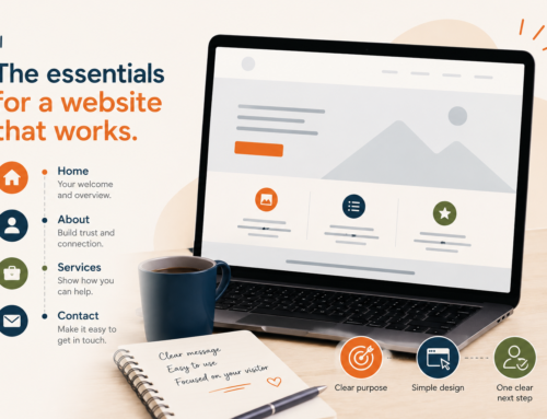
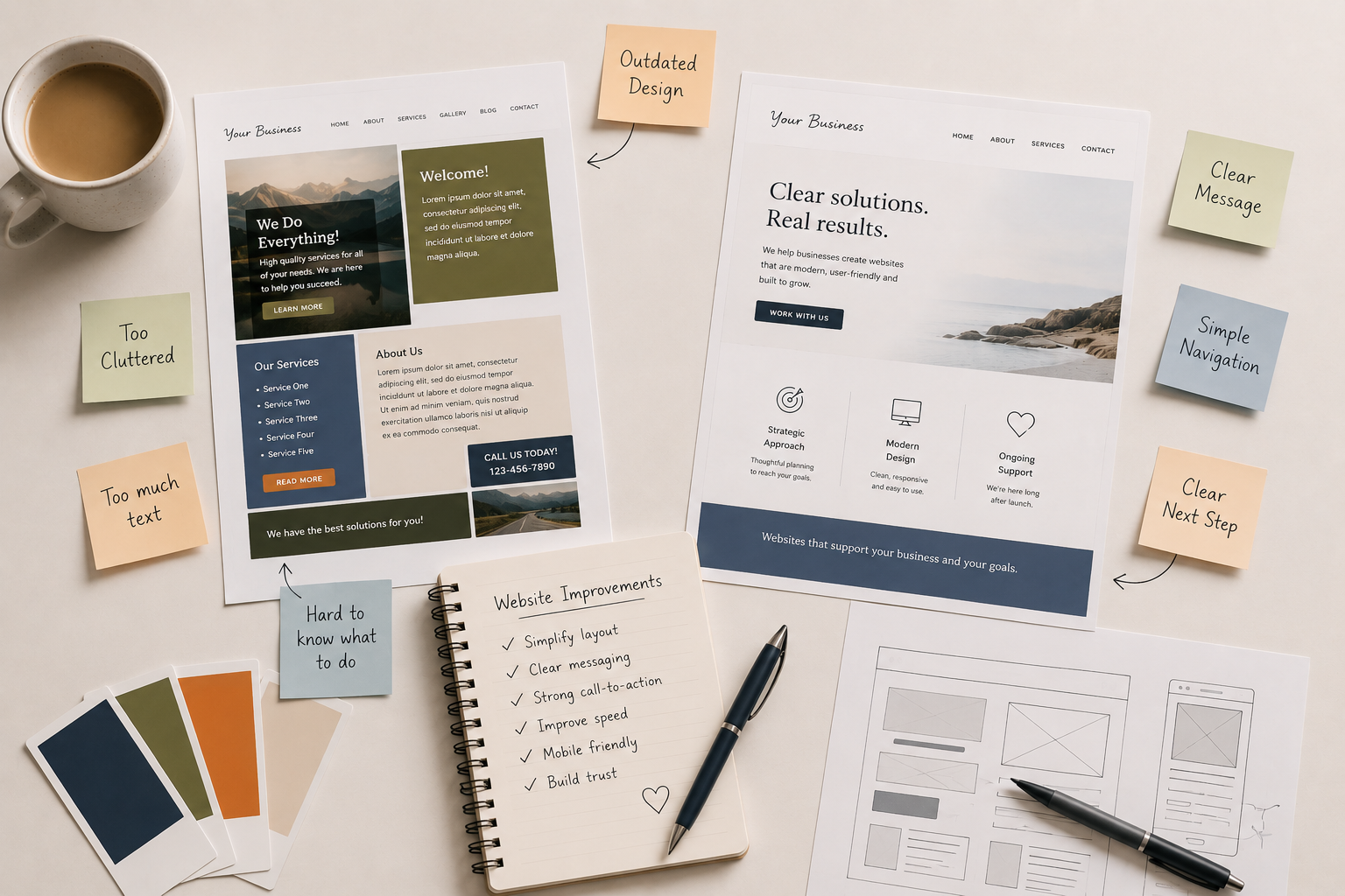
A homepage does not need to explain everything.
Its job is to help visitors quickly understand:
- who you are
- what you offer
- who it’s for
- and what step to take next
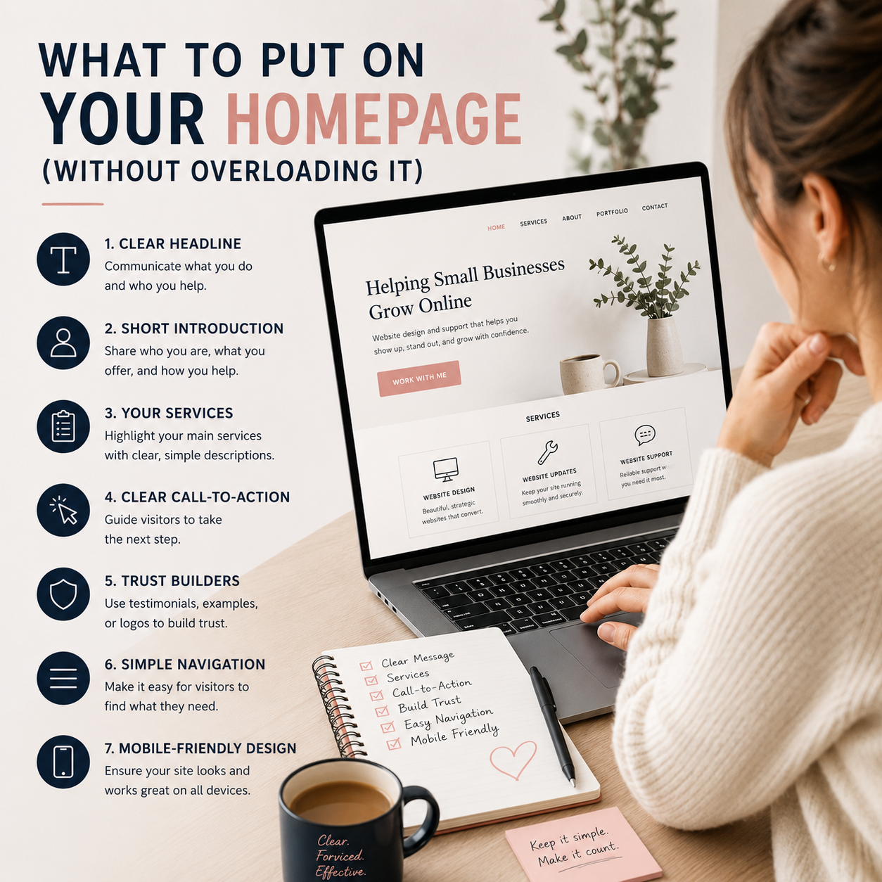
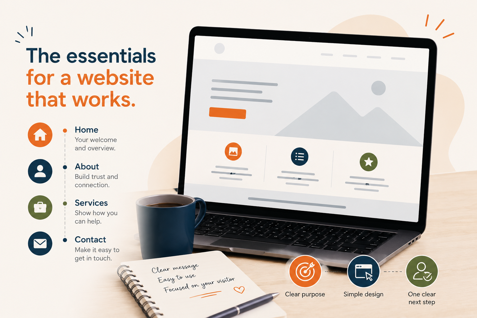
Here’s what a homepage actually needs — without overloading it.
1. A Clear Headline
Your homepage headline is one of the first things visitors notice.
Within a few seconds, people should understand:
- what your business does
- who you help
- or what kind of service you offer
This is not the place for vague slogans that sound nice but don’t explain anything.
Instead of:
“Creating Magic Online”
Try:
“Website Design & Support for Small Businesses”
Clear almost always works better than clever.
A Few Ways to Improve This
- keep headlines simple and direct
- avoid heavy jargon
- focus on what visitors need to know first
- prioritize clarity over creativity
Visitors should not have to “figure out” what your business does.
2. A Short Introduction About Your Business
After the headline, include a short section introducing:
- who you are
- what you offer
- and how you help
This does not need to be a long biography.
Think of it more like orientation.
A Few Ways to Improve This
- keep paragraphs short
- focus on visitor concerns
- avoid overwhelming detail
- write conversationally
- explain your services clearly
You can always go deeper on other pages.
3. A Clear List of Services
Your homepage should quickly show visitors what you offer.
This can be:
- short service blocks
- icons with descriptions
- linked sections
- or a simplified overview
You do not need to explain every service in full detail here.
The goal is simply to guide people toward the right pages.
A Few Ways to Improve This
- keep service descriptions brief
- use easy-to-scan layouts
- avoid giant text sections
- link to dedicated service pages
- prioritize readability
Simple navigation creates a much better experience.
4. One Clear Call-to-Action
A homepage should guide visitors toward a next step.
Without clear direction, visitors often leave without taking action.
Your call-to-action might be:
- Book a Consultation
- Request a Quote
- Schedule a Website Check-In
- Contact Me
- View Services
A Few Ways to Improve This
- use buttons that stand out clearly
- repeat important calls-to-action naturally throughout the page
- avoid too many competing buttons
- make the next step feel obvious and easy
Too many choices can create hesitation.
5. Trust-Building Elements
People want reassurance before reaching out.
Your homepage can build trust through:
- testimonials
- examples of work
- clear service explanations
- professional visuals
- or a calm, organized layout
Trust is often built through clarity and ease — not just design.
A Few Ways to Improve This
- add a few short testimonials
- include real examples of your work
- improve spacing and readability
- use consistent branding
- make your site feel organized and easy to use
A website that feels calm and professional creates confidence.
6. Simple Navigation
Your homepage should help people move through your website easily.
If navigation feels confusing, visitors may leave before exploring further.
A Few Ways to Improve This
- simplify menus
- reduce unnecessary pages
- organize content clearly
- avoid dropdown overload
- guide visitors naturally through the site
A clean structure helps people feel more comfortable staying on your website.
7. Mobile-Friendly Design
Most visitors now browse websites on phones.
Even a beautiful desktop homepage can become frustrating if:
- text is too small
- spacing breaks
- buttons are difficult to tap
- or sections become cluttered on mobile
A Few Ways to Improve This
- simplify layouts for smaller screens
- improve spacing
- increase mobile text size
- reduce oversized sections
- test your homepage on multiple devices
A mobile-friendly homepage creates a smoother experience for everyone.
Your Homepage Does Not Need to Say Everything
This is one of the biggest mindset shifts for many business owners.
Your homepage is not:
- your entire business story
- every service page combined
- or a place to answer every possible question
Its job is to:
- create clarity
- build trust
- and guide visitors toward the next step
Simple often performs better than overloaded.
Need Help Simplifying Your Homepage?
Sometimes it’s difficult to know:
- what should stay
- what should be removed
- or how to organize everything clearly
That’s where I can help.
Through a Website Check-In or Website Updates & Fixes support, I can help you:
- simplify your homepage structure
- improve messaging and clarity
- create a better visitor experience
- improve mobile usability
- and make your website feel more focused and professional
Sometimes small changes in structure and clarity can completely change how a website feels.